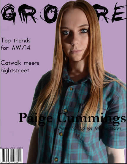
This is my magazine front cover at the moment. I decided to change the background to white as I felt it worked better and made my magazine more professional. The main image is changed to one I took recently and it is more central than my other image which, after looking at examples, seems to be the normal convention for a fashion magazine. I have also decided to go for a layout similar to the one that I did for my reconstruction as it looked more professional than the one I originally had. I have also decided to incorporate different colors and text sizes as I think it adds more to the overall cover and helps it look more appealing to the audience.
Monday, 8 December 2014
Monday, 1 December 2014
Website
Monday, 24 November 2014
Project update
Here are some screenshots of where I am at with my work.
After deciding to change the style of my work, I have only began changing the front cover and the billboard.
This is the front cover so far. I am still in the process of deciding on fonts and colors but I have changed the back ground to a lighter purple and decided to change the mast head. I also noticed that the page size was not A4 which I have corrected.
This is the billboard I have created. I used the new masthead and changed the placement to make better use of the white space. I decided to keep the background white as the other background did not look very professional. I also changed the image I used as the original one included a guitar but my magazine has no link to music.
At the end of the lesson I have made progress on both my front cover and contents page
After deciding to change the style of my work, I have only began changing the front cover and the billboard.
This is the front cover so far. I am still in the process of deciding on fonts and colors but I have changed the back ground to a lighter purple and decided to change the mast head. I also noticed that the page size was not A4 which I have corrected.
This is the billboard I have created. I used the new masthead and changed the placement to make better use of the white space. I decided to keep the background white as the other background did not look very professional. I also changed the image I used as the original one included a guitar but my magazine has no link to music.
At the end of the lesson I have made progress on both my front cover and contents page
Friday, 21 November 2014
Redo
I was not very satisfied with how my work was progressing so I spoke to my teacher and we looked at the work and decided it would be best if I started the design again.
I have decided to go for a different mast head font and have decided to alter the layout. I am going to keep the front cover purple but change the other pages to just have a plain white background as this follows typical magazine convention but also looks more professional.
I have also found some new fonts which I am going to use.
For my masthead I have found the font Black Jeans and I have found the font Kenyan Coffee, I am still using Fine Style and I am also using Century Gothic and Gill Sans which are a standard fonts.
I have also found some new fonts which I am going to use.
For my masthead I have found the font Black Jeans and I have found the font Kenyan Coffee, I am still using Fine Style and I am also using Century Gothic and Gill Sans which are a standard fonts.
Friday, 14 November 2014
Time management
Thursday, 13 November 2014
Model
This image shows me messaging my model and telling her in depth about the photo shoot so she is aware of what will happen and also about what she should wear for it.
Tuesday, 4 November 2014
Fonts
I have decided to go with the name Groture for my product. Whilst looking on dafont.com, I came across a font called grunge which I quite liked the look of for my masthead.
I decided to go with this font as I thought it fit best with my work in comparison to the others I had seen and I thought it worked well with the theme I was going for with my work. I did not consider any other fonts as I was happy with this one and thought it would be successful in helping me achieve the look I wanted for my product.
Subscribe to:
Posts (Atom)