Friday, 20 February 2015

recent drafts

Front Cover:


Contents Page:


Double Page Spread:


Billboard:


Website: http://stephwaller170395.wix.com/mediawebsite


Monday, 9 February 2015

Update

For my double page spread, I have decided to go with 3 styles instead of 4 due to composition of the pages. If I put 4 on the page, they would become quite cramped and I prefer them to be more clear and concise.

This is what my double page spread looks like right now. I am happy with how it is looking in comparison with previous drafts.

Wednesday, 4 February 2015

Model clothes and makeup

As my magazine focus's on grunge, I want to keep the makeup and clothing within this style as well. I have created a Pinterest board for clothes which would be appropriate and fit with my magazine.
https://uk.pinterest.com/stphx/media-outfits/


For the make up, I want the face to look quite flawless. I found this video on youtube which will be quite helpful. Although I won't be using the exact same products as stated in the video, I will still be using the steps she does which will allow me to achieve an even base on my model.


For the eyes, I am going to experiment both with and without eyeliner as I do not want the eyeliner to be too overpowering. This video I found on YouTube gives me 7 different ways I could style the eyeliner. Although not all of them will be classed as "grungey", they could still fit with the overall magazine and make it less overpowering.


Friday, 30 January 2015

26/1/15

After looking at my double page spread, I was not happy with how it looked so I decided to start again. I have used the font Fine Style as I think it looks professional and will fit well with my work.

Monday, 12 January 2015

12/1/15

Products so far:

Front Cover


Contents Page:


Double Page Spread:


Billboard:


Website:

Tuesday, 16 December 2014

Double page spread

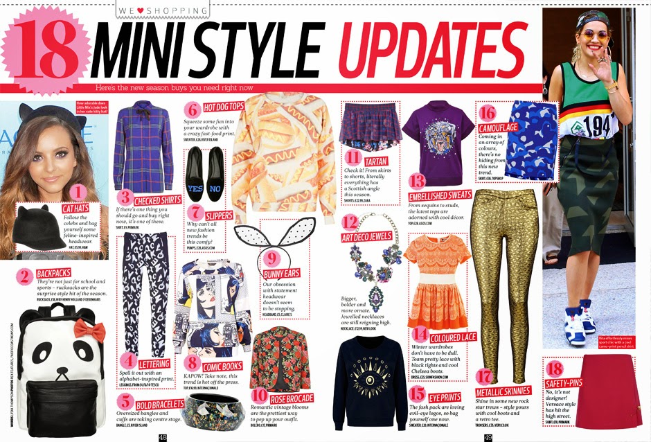
For my double page spread I decided to focus on different current trends. To get the images, I went to town with my friend and got her to try on different outfits and I took images on my phone. I am going to focus on 4 different trends: metallic, monochrome, graphics and lace.

 These are two examples of magazines where I like their composition and layout. I like how  they are quite busy and full but they're also structured well and easy to follow. I like the different pops of colour incorporated on both as well as it improves the overall look and catches the readers attention.


I used Stupeflix to create a video with all the images on that I had taken of my model wearing the clothes. I am going to remove the backgrounds and just use the model wearing the clothes. The looks I decided to go for were Metallic, Graphic Tee, Print and Lace. I decided to use these as they were included in the styles I had chosen to feature on my front cover and also, after looking at the photos I had taken, they were the strongest images and the ones I felt would work best with my work.

Monday, 8 December 2014

Magazine

This is my magazine front cover at the moment. I decided to change the background to white as I felt it worked better and made my magazine more professional. The main image is changed to one I took recently and it is more central than my other image which, after looking at examples, seems to be the normal convention for a fashion magazine. I have also decided to go for a layout similar to the one that I did for my reconstruction as it looked more professional than the one I originally had. I have also decided to incorporate different colors and text sizes as I think it adds more to the overall cover and helps it look more appealing to the audience.