Monday, 20 April 2015

Sunday, 19 April 2015

Evaluation Q4: How did you use media technologies in the construction and research, planning and evaluation stages?


Here are some photo examples of the things I mentioned in my video:

This is the icon for the webiste creator Wix.com. This is a software that is newly founded to me that I used to create my website.


This is the icon for the photo editing software Photoshop. I have used photoshop in both my AS and A2 and I feel my skills and understanding of this software have improved a lot over the last two years. Some new tools I discovered this year are shown below such as the dodge tool.

Evaluation Q3: What have you learned from your audience feedback?

I have created some reader profiles to demonstrate some people within my target audience and how this has helped develop my product as I am confident my target audience would be interested in my product.

Name: Paige
Age: 18
Preferred style of music: Alternative Rock, Pop Punk
Shops at: Topshop, New Look, Urban Outfitters
Hobbies: Socializing, social media, listening to music, watching movies


Paige is a prime example of my target audience group. I know she would be interested in my product as when I conducted audience research, her interests coincide with the majority of answers I received. For example, she fits within the age range for my target audience and likes to shop at places such as Topshop and Newlook which were very popular choices on my survey. As my product was tailored around these results, this makes me confident that she would buy it. She also enjoys using social media, like the majority of my target audience, which is reassuring in the idea that the website will be popularly used. I showed Paige my work and asked for a comment from her. She said "The magazine looks really good and it fits well with the magazine and billboard. It's definitely something I would read as it features clothes and shops that I like so it would be useful on getting some styling tips. The only thing I would recommend would be to add more onto the website as it looks a little bare."


I also spoke to another girl who also fit within my target audience.

Name: Rebecca
Age: 18
Preferred style of music: Alternative Rock, Pop Punk
Shops at: Topshop, Urban Outfitters, H&M
Hobbies: Photography, socializing, social media, listening to music, watching movies


After receiving feedback from both Paige and Rebecca, I have noted that if I were to redo this product there are things that have worked well and other things I could improve upon. I would take more photographs for my front cover and use a stronger image than the one I used in my final. I would also spend more time on my website as it could have benefited from more articles. I think my website could have been better as it was my first time using the software and I was not very confident using it. I would do more research into websites and how they are laid out as I think it would be beneficial.

Evaluation Q2: How effective is the combination of your main product and ancillary texts?


This video is to explain the links between my main task and my ancillary tasks which allow the audience to realize all the products are linked together but it also helps from a marketing point of view as it helps the publishers with advertising.
I did this by using the same conventions throughout such as color scheme, fonts, models, the masthead but I also advertised my products within each other. I placed a link for my website on the contents page and I also incorporated my magazine into my website by putting a photo of the current edition on the website homepage which would also work as an online preview of the magazine.

Evaluation Q1: In what ways does your media product use, develop or challenge forms and conventions of real media products?

Friday, 17 April 2015

New model

When editing my front cover, I could not get it to a standard I was happy with composition wise. Although I liked the main image, I thought it might be better if I changed the image and had an image where more of the clothes could be seen. I chose some clothes that fit with my style and got my sister to wear them for me to take the images. I kept with black, white and red clothes which I used to help achieve a grungey look. For make up, created a smokey eye, although this is not predominately visible and a strong contour look as these are current trends within my target audience and also fit within the theme of my product.
This is the front cover I created, although I do not think the main image is as strong as the previous image, I think by using this style of image it has allowed me to create a better composition compared to the previous draft.


After changing this, I realised I would also have to change my billboard image to keep continuity within the products and keep them linking together.


I kept the composition the same as the previous billboard and only changed the image to keep continuity.

Monday, 23 March 2015

Main task feedback


This is the feedback I received for my main task. Out of the 3 products, I have improvements to make for all of them which I am currently in the process of making.

Friday, 20 March 2015

billboard

After receiving feedback on my billboard, I decided to add some more text and change the colour of the background. It was not very clear that the billboard was advertising a fashion magazine as only the name "Groture" was stated which could have suggested it was a fashion brand or retailer. I decided to add "North East leading grunge magazine" as a tag line to let people know it is a magazine. To keep with the mirrored theme, I placed it in the bottom left third and the top right third of the page and used the text font "Fine Style Regular" which I have used in my main product to link them together and be consistent.

For the background, it was noted that the white did not fit with the theme and genre of my magazine. To fix this, I changed the background to a dark grey and then put it on a low opacity so it gave an off-white look. I think changing the colour to something other than white may not stay within typical conventions but I think it works well for my product based on its genre.

This is the billboard after I made these changes:


Friday, 20 February 2015

recent drafts

Front Cover:


Contents Page:


Double Page Spread:


Billboard:


Website: http://stephwaller170395.wix.com/mediawebsite


Monday, 9 February 2015

Update

For my double page spread, I have decided to go with 3 styles instead of 4 due to composition of the pages. If I put 4 on the page, they would become quite cramped and I prefer them to be more clear and concise.

This is what my double page spread looks like right now. I am happy with how it is looking in comparison with previous drafts.

Wednesday, 4 February 2015

Model clothes and makeup

As my magazine focus's on grunge, I want to keep the makeup and clothing within this style as well. I have created a Pinterest board for clothes which would be appropriate and fit with my magazine.
https://uk.pinterest.com/stphx/media-outfits/


For the make up, I want the face to look quite flawless. I found this video on youtube which will be quite helpful. Although I won't be using the exact same products as stated in the video, I will still be using the steps she does which will allow me to achieve an even base on my model.


For the eyes, I am going to experiment both with and without eyeliner as I do not want the eyeliner to be too overpowering. This video I found on YouTube gives me 7 different ways I could style the eyeliner. Although not all of them will be classed as "grungey", they could still fit with the overall magazine and make it less overpowering.


Friday, 30 January 2015

26/1/15

After looking at my double page spread, I was not happy with how it looked so I decided to start again. I have used the font Fine Style as I think it looks professional and will fit well with my work.

Monday, 12 January 2015

12/1/15

Products so far:

Front Cover


Contents Page:


Double Page Spread:


Billboard:


Website:

Tuesday, 16 December 2014

Double page spread

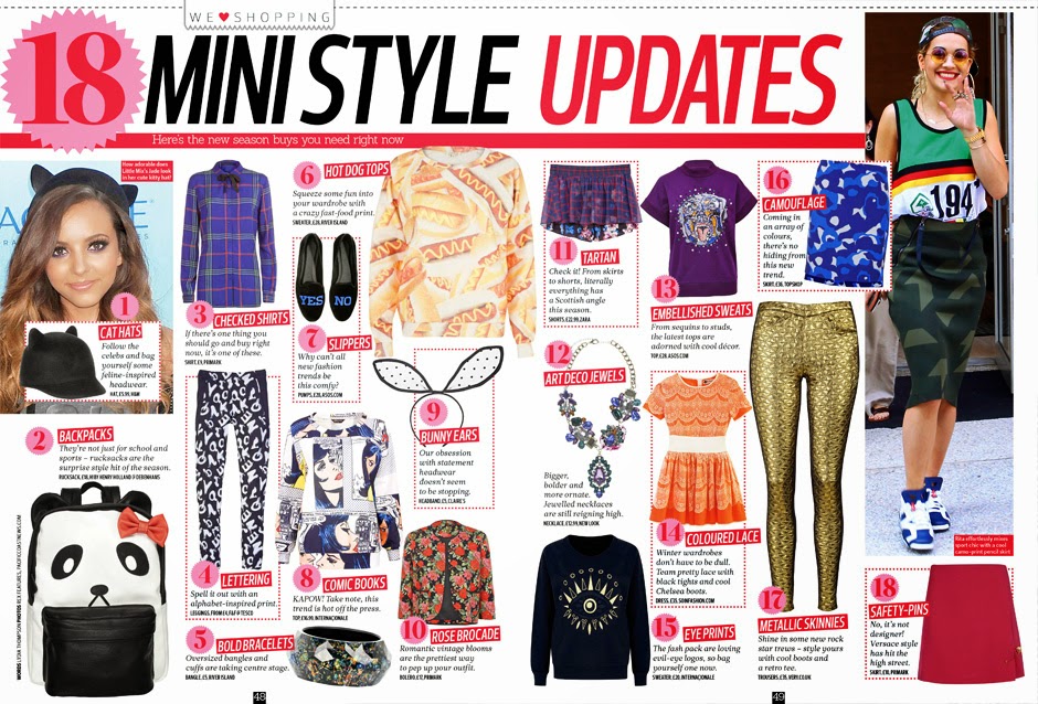
For my double page spread I decided to focus on different current trends. To get the images, I went to town with my friend and got her to try on different outfits and I took images on my phone. I am going to focus on 4 different trends: metallic, monochrome, graphics and lace.

 These are two examples of magazines where I like their composition and layout. I like how  they are quite busy and full but they're also structured well and easy to follow. I like the different pops of colour incorporated on both as well as it improves the overall look and catches the readers attention.


I used Stupeflix to create a video with all the images on that I had taken of my model wearing the clothes. I am going to remove the backgrounds and just use the model wearing the clothes. The looks I decided to go for were Metallic, Graphic Tee, Print and Lace. I decided to use these as they were included in the styles I had chosen to feature on my front cover and also, after looking at the photos I had taken, they were the strongest images and the ones I felt would work best with my work.

Monday, 8 December 2014

Magazine

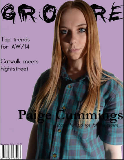
This is my magazine front cover at the moment. I decided to change the background to white as I felt it worked better and made my magazine more professional. The main image is changed to one I took recently and it is more central than my other image which, after looking at examples, seems to be the normal convention for a fashion magazine. I have also decided to go for a layout similar to the one that I did for my reconstruction as it looked more professional than the one I originally had. I have also decided to incorporate different colors and text sizes as I think it adds more to the overall cover and helps it look more appealing to the audience.


Monday, 1 December 2014

Website

I have decided to change the layout for my website. The original header I was using was this one
 and I have replaced it with this one.

I like the display of the second one as I think it is different to just a standard website and is more interesting.

Monday, 24 November 2014

Project update

Here are some screenshots of where I am at with my work.

After deciding to change the style of my work, I have only began changing the front cover and the billboard.
 This is the front cover so far. I am still in the process of deciding on fonts and colors but I have changed the back ground to a lighter purple and decided to change the mast head. I also noticed that the page size was not A4 which I have corrected.
This is the billboard I have created. I used the new masthead and changed the placement to make better use of the white space. I decided to keep the background white as the other background did not look very professional. I also changed the image I used as the original one included a guitar but my magazine has no link to music.


At the end of the lesson I have made progress on both my front cover and contents page


Friday, 21 November 2014

Redo

I was not very satisfied with how my work was progressing so I spoke to my teacher and we looked at the work and decided it would be best if I started the design again.

I have decided to go for a different mast head font and have decided to alter the layout. I am going to keep the front cover purple but change the other pages to just have a plain white background as this follows typical magazine convention but also looks more professional.

I have also found some new fonts which I am going to use.
For my masthead I have found the font Black Jeans and I have found the font Kenyan Coffee, I am still using Fine Style and I am also using Century Gothic and Gill Sans which are a standard fonts.


Friday, 14 November 2014

Time management

At the beginning of this lesson, this is the work I currently have:


After the lesson, I had updated my front cover and created a billboard.


Thursday, 13 November 2014

Model


There were some scheduling problems with the studio and my model so I decided to ask a different friend to model. I decided to take the images during a studio session in my photography class as it seemed the only available option for the studio.

This image shows me messaging my model and telling her in depth about the photo shoot so she is aware of what will happen and also about what she should wear for it.

This is an image of the make-up I will use on the model. I want to keep the face quite natural and focus mainly on eyeliner.