For my double page spread I decided to focus on different current trends. To get the images, I went to town with my friend and got her to try on different outfits and I took images on my phone. I am going to focus on 4 different trends: metallic, monochrome, graphics and lace.
These are two examples of magazines where I like their composition and layout. I like how they are quite busy and full but they're also structured well and easy to follow. I like the different pops of colour incorporated on both as well as it improves the overall look and catches the readers attention.
I used Stupeflix to create a video with all the images on that I had taken of my model wearing the clothes. I am going to remove the backgrounds and just use the model wearing the clothes. The looks I decided to go for were Metallic, Graphic Tee, Print and Lace. I decided to use these as they were included in the styles I had chosen to feature on my front cover and also, after looking at the photos I had taken, they were the strongest images and the ones I felt would work best with my work.
Tuesday, 16 December 2014
Monday, 8 December 2014
Magazine
This is my magazine front cover at the moment. I decided to change the background to white as I felt it worked better and made my magazine more professional. The main image is changed to one I took recently and it is more central than my other image which, after looking at examples, seems to be the normal convention for a fashion magazine. I have also decided to go for a layout similar to the one that I did for my reconstruction as it looked more professional than the one I originally had. I have also decided to incorporate different colors and text sizes as I think it adds more to the overall cover and helps it look more appealing to the audience.
Monday, 1 December 2014
Website
Monday, 24 November 2014
Project update
Here are some screenshots of where I am at with my work.
After deciding to change the style of my work, I have only began changing the front cover and the billboard.
This is the front cover so far. I am still in the process of deciding on fonts and colors but I have changed the back ground to a lighter purple and decided to change the mast head. I also noticed that the page size was not A4 which I have corrected.
This is the billboard I have created. I used the new masthead and changed the placement to make better use of the white space. I decided to keep the background white as the other background did not look very professional. I also changed the image I used as the original one included a guitar but my magazine has no link to music.
At the end of the lesson I have made progress on both my front cover and contents page
Friday, 21 November 2014
Redo
I was not very satisfied with how my work was progressing so I spoke to my teacher and we looked at the work and decided it would be best if I started the design again.
I have decided to go for a different mast head font and have decided to alter the layout. I am going to keep the front cover purple but change the other pages to just have a plain white background as this follows typical magazine convention but also looks more professional.
I have also found some new fonts which I am going to use.
For my masthead I have found the font Black Jeans and I have found the font Kenyan Coffee, I am still using Fine Style and I am also using Century Gothic and Gill Sans which are a standard fonts.
I have also found some new fonts which I am going to use.
For my masthead I have found the font Black Jeans and I have found the font Kenyan Coffee, I am still using Fine Style and I am also using Century Gothic and Gill Sans which are a standard fonts.
Friday, 14 November 2014
Time management
Thursday, 13 November 2014
Model
This image shows me messaging my model and telling her in depth about the photo shoot so she is aware of what will happen and also about what she should wear for it.
Tuesday, 4 November 2014
Fonts
I have decided to go with the name Groture for my product. Whilst looking on dafont.com, I came across a font called grunge which I quite liked the look of for my masthead.
I decided to go with this font as I thought it fit best with my work in comparison to the others I had seen and I thought it worked well with the theme I was going for with my work. I did not consider any other fonts as I was happy with this one and thought it would be successful in helping me achieve the look I wanted for my product.
Wednesday, 29 October 2014
Photography issues
Today I had arranged to go into the studio to take some images for my product. Unfortunately, I had unforeseen issues with my camera which have stopped me from doing this. I have rearranged with my model to take the images after half term when more studio space is available and once I have sorted my camera, I will take images of clothing items at home for my double page spread.
Friday, 24 October 2014
lighting
For my product I am going to be using high key lighting as it is the standard for fashion photography and will make my images look more professional. Here is a diagram I found on google which explains the set up of high key lighting. The main focus of high key lighting is to eliminate shadow. I will do this by lighting the background as well as the model.
Poses
When looking at examples of well known fashion magazines, I have noticed that the main images are never full body, they usually use mid shots. I will take this into consideration when taking my own images. Here are some poses I will get my model to try.
I like this pose as it is in between high fashion and standard fashion which will give help make my magazine look more professional.
I like this pose as it is not the typical pose you see in magazines. I also like how you can see the outfit as that is a big focus for my magazine. The problem I see with this is that this image uses a different background to the plain studio background I will be using. I will still try this pose and see if the different background has any influence.
Monday, 20 October 2014
Recce
1.
Are there any potential hazards that
could pose a health and safety risk where your photo shoot will take place
(trailing cables/traffic/other objects)?
In
the photography studio, there are light cables and such, which could present a
safety risk.
2.
What will you do to ensure these risks
are minimised?
I
will make sure everyone in the room is aware of the cables and I will move them
so they are still functional but pose as little risk as possible.
3.
Will the time of day/weather affect the
outcome of the photos? Have you allowed for this?
As
the studio is indoors, I will control the lighting and therefore the images
will not be affected by weather or time of day.
4.
Have you considered the background to
your photos, particularly if taken outside? How will you ensure you will get
the background you want?
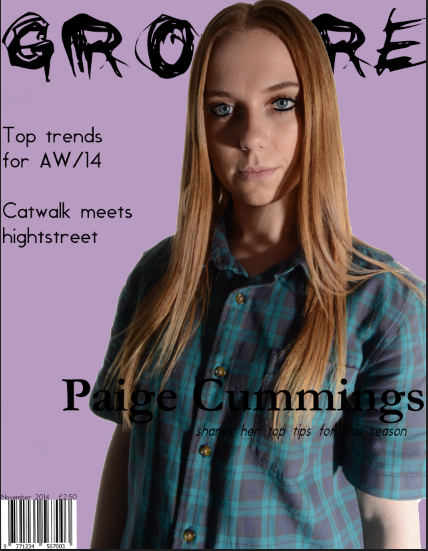
I
am going to have a plain background in the studio as I want to take them with
high key lighting, however, I may try different background colours in Photoshop
once the images are taken.
5.
Have you considered lighting? What
about the ‘problems’ of natural lighting, either outside, or streaming through
a window? Will you need to use a flash? Have you considered reflective objects
that might spoil the effect?
I
am going to use high key lighting for my images. The studio I am going to use has
all forms of natural lighting blocked out so the only light that will be
photographed is what I put on. I will be using flash to fully optimise the high
key lighting.
6.
Do you need permission to take photos
in the place/venue you have in mind?
I have asked my photography teachers about the availability
of the studio and I am allowed to use it during the holidays when teachers are
in to provide equipment.
7.
Do you need to book time in a room (eg
the photography studio at Shiney)?
I have asked my teacher about the availability of the studio
and she is going to inform me of the days there is a teacher or technician in
to help with equipment. I will then book some time on one of these days.
8.
Are other people/crowds likely to be an
issue for you? What have you done to ensure that it will not spoil the effect?
Crowds are not
an issue as the images are being taken in a controlled environment.
9.
Are you reliant on lifts/props/friends’
equipment/models? How have you planned that these things will come together at
the appointed time? Plan B?
I have asked a
friend who has agreed to be my model however if she cannot, my sister has
agreed to do it. The camera I am going to use is my own and the lighting is provided by the
college.
10. Finally,
have you thought of every eventuality…?
Yes I think so
Tuesday, 14 October 2014
audience research
To get an insight into my target audience I created a survey on surveymonkey.com in which I asked questions to the girls in my media class. This is helpful as there is a mix of styles but also of girls who do and don't read magazines which will give me a more unbiased result.
The people I asked were all within the age range of 16-19 which fits with my target audience and the majority of them said they read fashion magazines and they do this to keep up with the latest trends, which shows that their input will be very valuable.
When looking at the results, it showed that the things that attract people to buying a fashion magazine most are the model/outfit and the content and found the most important aspect of a front cover to them is the model/actress. The font and colour also seemed to be important.
In terms of price, most people said they would pay within the range of £2 and £2.99 which is around what I was going to charge due to my target audience being mainly students with part time jobs.
I asked what stores they mostly shop at. The top shops were:
Topshop
River Island
New Look and H&M
This is useful as it allows me to see the styles of the people that are going to be reading my magazine and if it will relate to the type of fashion I wanted to use in mine. Luckily, the clothes from most of these stores are similar to the style I was going for.
This video shows someone a few years older than in my survey but still within my target audience age range. I asked her the same questions that were on the survey and her answers were similar to those I had received before which strengthened my results.
The people I asked were all within the age range of 16-19 which fits with my target audience and the majority of them said they read fashion magazines and they do this to keep up with the latest trends, which shows that their input will be very valuable.
When looking at the results, it showed that the things that attract people to buying a fashion magazine most are the model/outfit and the content and found the most important aspect of a front cover to them is the model/actress. The font and colour also seemed to be important.
In terms of price, most people said they would pay within the range of £2 and £2.99 which is around what I was going to charge due to my target audience being mainly students with part time jobs.
I asked what stores they mostly shop at. The top shops were:
Topshop
River Island
New Look and H&M
This is useful as it allows me to see the styles of the people that are going to be reading my magazine and if it will relate to the type of fashion I wanted to use in mine. Luckily, the clothes from most of these stores are similar to the style I was going for.
Friday, 10 October 2014
Studio booking
For my product, I am planning to take my images in the studio at college. I went to see my photography lecturers to look at booking times however they were not in college. I am planning to see them next Tuesday when I have my next photography lesson.
UPDATE:
Over half term, the photography studio will be open on the Wednesday of half term so that will be when I take my images.
UPDATE:
Over half term, the photography studio will be open on the Wednesday of half term so that will be when I take my images.
Thursday, 9 October 2014
Double page spread flat plan
This is the flat plan I have created for my double page spread. I thought keeping the layout would help keep it structured and put together. The fonts and colours will all be a continuation of my front cover and contents page to keep everything tied in and together.
I decided to put the title at the top of the page, this will help the reader easily find the article and it also keeps in with general convention.
I then decided to keep the text predominant on both pages as it is the main feature and by filling the page with text it will allow me to put more information into the article. I considered incorporating different font sizes, styles and colours in the article to keep it from being plain and losing the reader's interest.
I then placed the page numbers in the bottom outside corners of the page. I did this as it follows standard magazine convention and allows the reader to easily navigate around the magazine.
Flat plan for website
This is the flat plan for my website. I am going to put the masthead at the top of the page so it is very eye-catching and I am going to put links to social media next to it as it will be easier for the reader to see and with my target audience being more technology based, they are more likely to view the links. The fonts will not be exactly the same as what I am using in my magazine but I will pick the fonts that are most similar or that go well together. For colour, I am going to have the header as a block colour and keep the rest white as I think this will keep it quite simple which I prefer.
Contents Page flat plan
This is the flat plan I have created for my contents page. I am going to have the mast head present in the top left third of the page but it will be smaller then on the front cover as it is not the main focus. I will a main image on the left half of the page and place the articles on the right side opposite. I will also have the date located on the top right third and the page number on the bottom left third as I have seen these present on other magazines. The fonts used on this page will be a continuation of the fonts used on my front cover, this will tie the pages together and look professional, I will keep the colour scheme the same for these reasons also. The image will be taken in high key with direct mode of address at eye level. I think this is a good standard for taking my images as I think they all help engage the viewer.
Friday, 3 October 2014
Front cover flat plan
This is the flat plan I have created for the front cover of my magazine. I am keeping the masthead located across the top thirds of the page and placing the image in the centre. Some of the masthead will be covered by the image to give the impression that my magazine is established and well known. I will have sell lines on both sides of the image however they will not be too overpowering. I will place the essential information such as price, date and barcode in the bottom left third of the page so it does not distract from the rest of the magazine. With my model, I am going to use a direct mode of address as it engages the viewer and makes it more personal. I plan on keeping camera shots to medium close ups and close ups as I think it helps show the clothes but I like the overall look of these magazines more than ones where the full body of the model is showing. Font wise, I have found some fonts that I like that I am going to play about with and see what they look like. These include Grunge, Kenyan Coffee, Champagne & Limousine, Neou and standard fonts such as Century Gothic. The lighting is going to be high key as this makes the image look more professional and fits with generic convention of magazines. My colour scheme is going to be quite pastel with black as a default colour.
For the main image, it is going to be of my friend Paige. It will have a direct mode of address with her looking directly into the camera. This is to make it more personal to each reader and make the front cover more engaging. It will be quite high key as this is a typical convention of fashion magazines and will make my work look more professional. She will be wearing grunge style clothing that fits with the theme of my magazine and demonstrates to the reader the type of clothes that will be featured in my work.
Wednesday, 1 October 2014
October Calendar
Monday, 22 September 2014
Institution Logo
When it came to creating my own logo, I decided to call it SW Productions. I did this as SW are my initials.
I began to create the image in photoshop. I used the text icon and created separate text levels for the different letters, keeping them the same font and size.
I then placed the S in the centre of the W and placed productions underneath. I decided to put it in italics as I thought it looked too plain when it was standard.
For the colours I kept to black and dark tones as I am going to make my product grunge fashion and thought this fit in well with that style.
inspiration
With this image, I like the idea of using a plain colour other than white for the background. I think it is unusual and adds something different to the page. I also like the set up with how the image and text are positioned as it is quite simple but I like the overall look.
After seeing this image, I like the way they have used a different colour for the masthead as it keeps it separate from the rest of the text but also catches the audiences attention.
Monday, 15 September 2014
Website Deconstruction
COMPANY
I looked at the website for the magazine Company. At the top of the website, there is their masthead. It is positioned on the left third of the page and is not the main focus however it is still large enough to catch the viewers attention. The navigational links are also at the top of the page. This helps the viewer navigate the website easily and find what they are looking for without any issues.
Placed just below this, on the right third of the page are links to various social networks. This positioning is a good idea as it is easy to see and one of the first things the audience will notice. It is also good as the target audience of this magazine are very technology orientated and are avid users of social media.
There is also a link to join up to their website. This is a good idea as it allows the audience to keep up with the latest articles but it also gives the company a sure way of getting their product across to their target audience.
After looking at this website, I think it is a good indication of how I want my own website to look. I think having the navigation bar at the top of the page is beneficial as it will allow my viewers to easily navigate the site. Also, by displaying links to other social media platforms, this is aimed at capturing my target audience as they are very tech savvy and will all use most, if not all, of the social media forms I link. It will also be useful for advertising as it will reach more people of my target audience than if I just had the website and magazine.
Friday, 12 September 2014
double page spread deconstruction
Looking at this double page spread, I like the idea of having one page dedicated to an image as I think it pulls the spread together well, however, I am unsure as to whether it would be appropriate for my fashion magazine. I don't like the use of the giant drop caps as I think its confusing and I don't like how it looks so I won't be using this in my own work.
front cover deconstruction
Looking at this front cover, I like the idea of having a coloured background other than white as I think it is unique and I like the look of it. I also like the continuity of font and colour scheme as I think it looks more professional and put together so I will be doing that with my own work. I like the pose, however, I think it is a bit more high fashion than what my magazine is aiming to be so I would not use it.
Thursday, 11 September 2014
contents page deconstruction
Looking at this example, I like the idea of having one main image on my contents page as I think it helps the page look more put together. I may try having 1 or 2 main images instead of using many smaller images. I also think it is a good idea to put the link to the website on the contents page as it increases the chance of the reader visiting the site. I don't like how big the title is on this page though as it is quite over-powering so I will keep mine smaller on my own work.
billboard deconstruction
Looking at billboards that are already in use, I have decided that for my own I am going to keep the layout quite simple. I will use mostly black and white but will incorporate some colour slightly. The only text that will be on my billboard will be the magazine name although it will not be the main focus as I do not like the composition in the Marc Jacobs billboard. All three billboards use quite high key lighting which I will also use in mine as it is more professional and appropriate. I will also use a direct mode of address to attract and engage my target audience. The camera angle will be a typical eye level shot as it works well for my product.
Wix
As it is the first time I have used this website, I have encountered difficulties when trying to get the website to go the way I want. After much trial and error, I have improved and developed knowledge of how to use the site however, I think it will be easier to use when making my own website and not trying to edit a layout to fit an already existing website.
mood board
This is a moodboard I created for my work. The fonts are some I found on dafont.com which I am planning to use as I think they will go well with the style of my magazine. The colour palette is what I created to show the different colours I am planning to use in my project. The shop logos represent the types of fashion shops people in my target audience will shop at and the image of the model shows the type of fashion I am interested in including in my final product. I have also added a female icon with 17+ as this represents my target audience.
Wednesday, 10 September 2014
Pitch feedback
This is my media pitch and the feedback that I got for it. From looking at the feedback, it is clear I need to concentrate more on institutions and and maybe go into more detail on my choices and reasonings.
Monday, 1 September 2014
September Calendar
This month, the main tasks I want to complete are to start research and planning for my product and to finish reconstructions of products. I need to start research and planning as this will be the start of creating my own product and will help me plan effectively and keep note of choices and plans I make.
I also want to finish and upload reconstructions as these tasks are similar to what I am going to be creating myself which will help give me some knowledge and experience of these types of products and their conventions.
Sunday, 10 August 2014
magazine 4 pages reconstruction - double page spread
This is the second page that I am going to recreate and the second half of the article. Below is the flat plan I have created for this page.
These are the reconstructions I created. I think they turned out quite well however, the second page was harder to reconstruct and I was unable to add in the image. I found keeping the composition of the text to the original quite challenging as could not find the exact fond and had to compromise.
Saturday, 9 August 2014
magazine 4 pages reconstruction - contents page
The task states that I need to reconstruct a magazine's front cover and 4 pages from the magazine itself. The front cover I chose to recreate, I found online, and the 4 pages I am going to recreate are from a Vogue magazine I bought at a much later date. As it is a fashion magazine, most of the pages are all advertisements, so the 4 pages I am going to recreate are 2 for the contents page and 2 for a double page spread. These are the images of the contents page I am going to recreate and the flat plans I made for this.
Subscribe to:
Posts (Atom)